
The first taste of trust.
Helena and Tobias, the founders of After Fun GmbH, approached us with a vision: to launch a mineral-based recovery drink that feels anything but ordinary. In a market saturated with flashy designs and artificial energy, After Fun needed something real. We supported them in shaping a brand that balances clarity with energy, leaving a lasting impression.
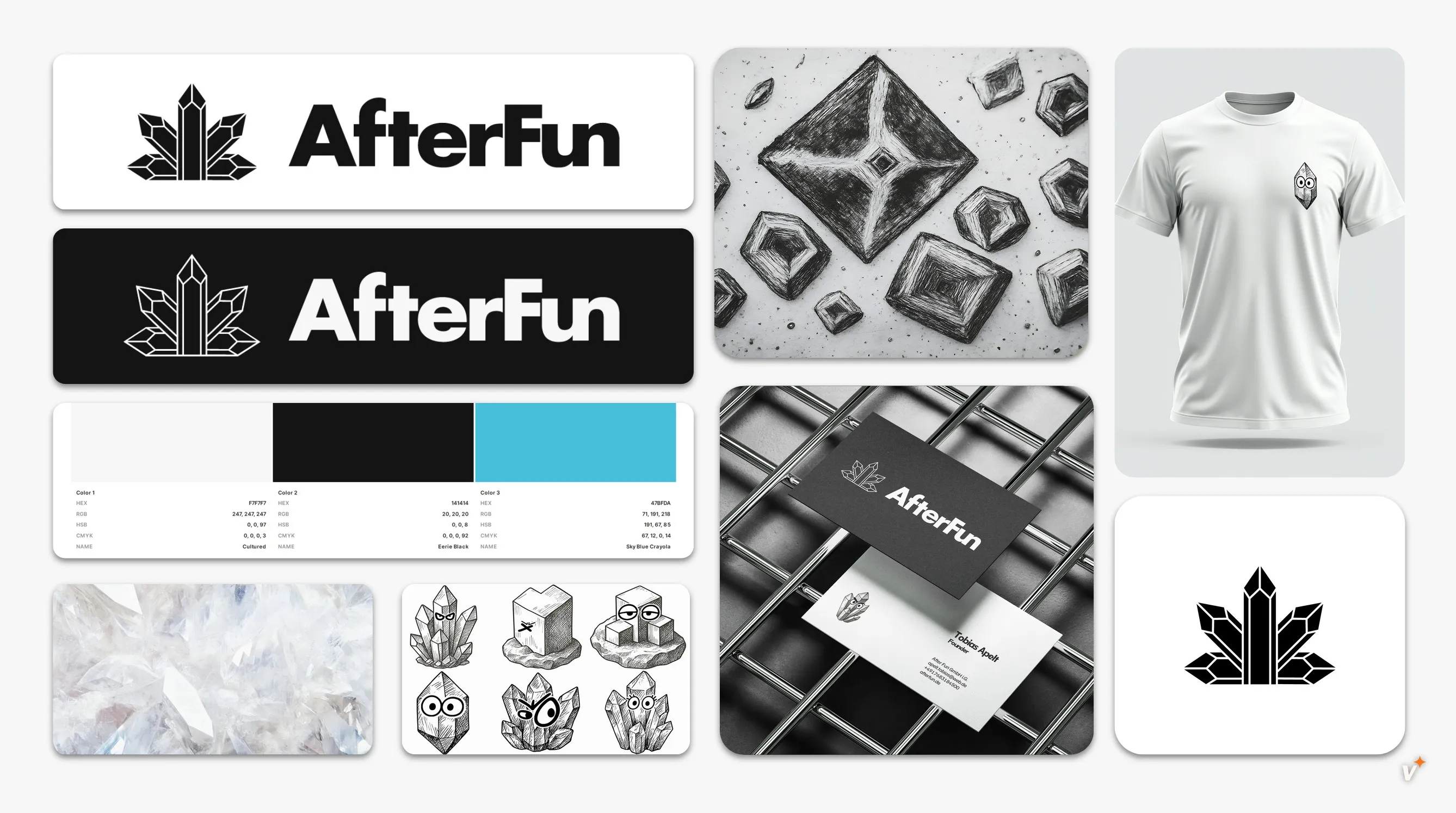
The collaboration began with an in-depth brand strategy phase. We worked closely with the founders to define their positioning, values, and audience. Based on this foundation, we developed a unique brand identity and logo design. The goal: a look that stands out on crowded shelves and connects with a new generation of consumers through honesty, minimalism and crystal-clear visual elements.
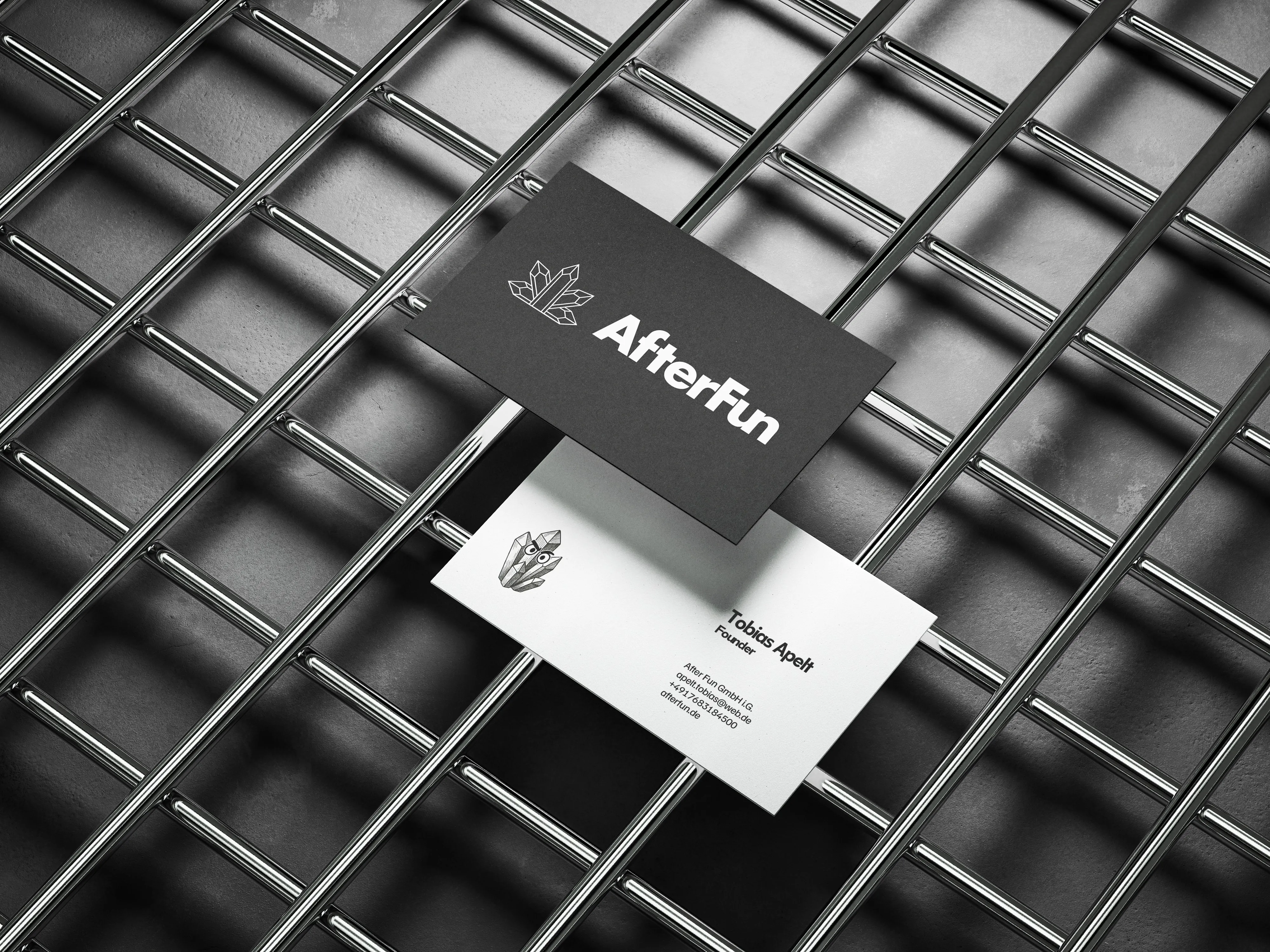
The visual identity combines monochrome clarity with subtle mineral-inspired textures. The logo is bold and clean, with crystal shapes integrated to reflect the core ingredients and product focus. In addition to the full identity package, we designed a minimalist business card for personal impact. A packaging design for the can is currently in development with more visual assets to follow.
This case shows how thoughtful design paired with strategic clarity can build instant brand recognition, even in highly competitive spaces. We look forward to continuing the journey with After Fun and helping their brand grow across touchpoints.
Project Showcase
Explore our stunning visuals and quality craftsmanship.

"Really great job, it's fun working with you!"
%20-%20White%20BG.webp)
Your Project, Our Design
Let's work together to transform your vision into stunning graphics and videos.